EventArk – An Event Gifting Platform
Social
EventArk – An Event Gifting Platform
Eventark is an event specific gifting platform where users share and celebrate their life events and milestones with family and friends, and their family and friends celebrate them and gift them cash, gift items from their wish-list, or an experience.
Work
UI Design, User Experience Design, User Research, Wireframing, Afinnity Diagram, Usability Testing, Crazy 8’s method, Sketching
Introduction
As digital gift-giving evolves, platforms that facilitate personalized and meaningful interactions have gained traction. Eventark is an innovative event-specific gifting platform designed to enable users to share and celebrate life events and milestones with family and friends. Through Eventark, users can receive gifts in the form of cash, items from their wish-list, or curated experiences, fostering a seamless and heartfelt exchange. This case study examines the UI/UX design process undertaken to develop Eventark, focusing on creating an intuitive, engaging, and emotionally resonant user journey tailored to the platform’s unique social and functional goals.
Understanding the Problem and User Needs
The first step in my process was to clarify the key objectives of Eventark’s platform. The main challenge was to design a user interface that would be simple enough for a wide range of users, both gift-givers and recipients to navigate but flexible enough to support multiple gifting options. To better understand the users and their expectations, I conducted informal interviews and analyzed existing gifting platforms to identify gaps, pain points, and opportunities.
The platform needed to accommodate diverse user roles, event creators, gift-givers, and recipients, each with specific needs and expectations. Key objectives included designing a visually appealing interface, reducing friction in gift selection and payment, and encouraging community interaction around milestones.
Ideation Board
Design Sprint · Week 02
Research → Insights → Ideas
Research → Insights → Ideas
Research Insights & Ideation Clusters
Pain Points
😫
Gift Duplication
"I got 4 candles for my birthday — 4!"
💸
Awkward Money Asks
Feels rude to say "just send cash" — needs a graceful wrapper
📱
WhatsApp Chaos
Gift coordination across 6 family groups is exhausting
🌍
Diaspora Gap
Family abroad can't ship — ends up sending nothing
Desires
🎉
Public Celebration
People want milestones witnessed, not just noted
✨
Useful Gifts
"I'd rather have 1 thing I love than 10 I don't"
🌟
Experience Over Things
A spa day, a concert, a weekend trip — more memorable
🤝
Group Gifting
Pooling £20 each for something big feels more meaningful
Gifter Behaviour
🤷
Guesswork Default
Most gifters resort to Amazon "Best Sellers" in desperation
🎯
Intent is High
People genuinely want to give well — they just lack signals
⏰
Last-Minute Buying
69% of survey respondents buy within 3 days of an event
👀
Social Proof Matters
Seeing others contribute encourages participation
Ideas 💡
📋
Event + Wish-list
One page: the event details AND exactly what's wanted
💰
Cash Gift Wrapper
Send money with a "purpose" — "towards your MacBook"
🔔
Smart Reminders
"Your friend's 30th is in 7 days — they added 3 new items"
🎭
Experience Gifting
Browse & book curated experiences directly on platform
🔍
Insight #1
Gift-givers have high motivation but zero information. The gap isn't generosity — it's signal.
🔍
Insight #2
Event + wish-list in one shareable link removes the coordination friction entirely.
🔍
Insight #3
Cash gifting only feels transactional without a narrative. Wrap it in purpose and it becomes meaningful.
🔍
Insight #4
Diaspora users are an underserved, high-intent audience who currently have no good options.
HMW →
How might we make sharing a milestone feel celebratory, not promotional?
How might we help gifters feel confident every time?
How might we make cash gifting feel warm and personal?
How might we bring diaspora families into the celebration?
Eventark · Design Thinking · Ideation Session · 2025
Empathise ✓
Define ✓
Ideate ← Now
Prototype
Test
Research and User Insights
Initial research involved competitor analysis of existing gifting and social platforms, alongside qualitative user interviews with potential users aged 25–45 who frequently participate in gift-giving for birthdays, weddings, and other celebrations. Findings highlighted common pain points such as complicated checkout systems, impersonal gift options, and fragmented communication between parties. Users sought a personalized, streamlined experience that could also accommodate group gifting dynamics.
User Personas
👩🏽
🎂
TobiAdeyemi
The Milestone Sharer
"Life is better when shared."
🎁
29
Age
Lagos
Location
Brand
Strategist
High
Social
About
Tobi loves celebrating every win — big or small. From a new job to turning 30, she posts, plans, and pulls people together. She has a wide social circle across family and friends, and gift coordination has always been chaotic and stressful for her.
Goals
Share her milestones beautifully with family and friends in one place
Receive meaningful, useful gifts — not duplicates or mismatches
Make it easy for loved ones abroad to contribute cash or buy from her wish-list
Pain Points
😩Receives random gifts she doesn't want or need
💸Awkward asking for money directly; feels transactional
📱Managing RSVPs and gifts across WhatsApp groups is exhausting
"I just want people to know what I actually want, and be able to contribute — no matter where they are in the world."
How she uses Eventark
🎉Creates Events
📋Builds Wish-lists
🌍Shares with Diaspora
💰Accepts Cash Gifts
Interests
Travel
Fashion
Brunch Culture
Career Growth
Home Decor
Wellness
👨🏻
🎊
James Adams
The Thoughtful Gifter
"I want every gift to count."
💝
43
Age
Abuja
Location
Finance
Manager
Med
Social
About
James is a devoted dad, husband, and close friend who takes gifting seriously. He hates wasting money on something that won't be appreciated. When family members post milestones on social media, he wants a frictionless way to actually do something meaningful — not just like a post.
Goals
Give gifts he knows will be wanted and used — zero guesswork
Pool money together with others for a bigger, more impactful gift
Gift experiences (spa days, travel, dinners) beyond just physical items
Pain Points
🤷Never knows what people actually want — ends up guessing wrong
🔁Coordination with other family members leads to duplicate gifts
🌐Gifting international family members is logistically complicated
"I don't mind spending generously — I just need to know it'll land right. Seeing them actually use or enjoy it is the whole point."
How he uses Eventark
🔔Tracks Events
🛍️Buys from Wish-list
🤝Group Contributions
✨Gifts Experiences
Interests
Family
Fine Dining
Tech
Cycling
Personal Finance
Live Music
Design Process and Framework
Based on initial insights, I mapped out user personas representing typical users: busy professionals, family members unfamiliar with digital gifting, and tech-savvy friends looking for quick and meaningful gift solutions. Using these personas, I sketched user journeys to visualize the steps involved in event creation, wish-list curation, gifting, and celebration.
To structure the workflow, I applied fundamental principles from user-centered design and the Nielsen Norman Group’s usability heuristics. Ensuring consistency, minimizing user effort, and maintaining clear feedback were priorities. Additionally, I adapted elements from the AIDA model (Attention, Interest, Desire, Action) to encourage engagement at every stage of the gifting process.
The design process followed a user-centered design (UCD) approach, combining iterative prototyping with feedback loops to refine the interface and interactions. Utilizing Nielsen’s usability heuristics as a guiding framework ensured consistency, error prevention, and clear visibility of system status throughout.
The development stages were:
Ideation and Wireframing: Low-fidelity wireframes were created to map core flows such as event creation, wish-list management, and gift contribution.
Prototyping: Mid- and high-fidelity interactive prototypes were developed using tools like Figma to simulate user interactions and enable early usability testing.
User Testing: Conducted moderated sessions with target users to gather qualitative and quantitative feedback, focusing on navigation ease, emotional engagement, and transaction clarity.
Iteration: Based on feedback, redesigned navigation elements to reduce cognitive load, enhanced visual hierarchy for better scanability, and simplified payment workflows to minimize drop-offs.
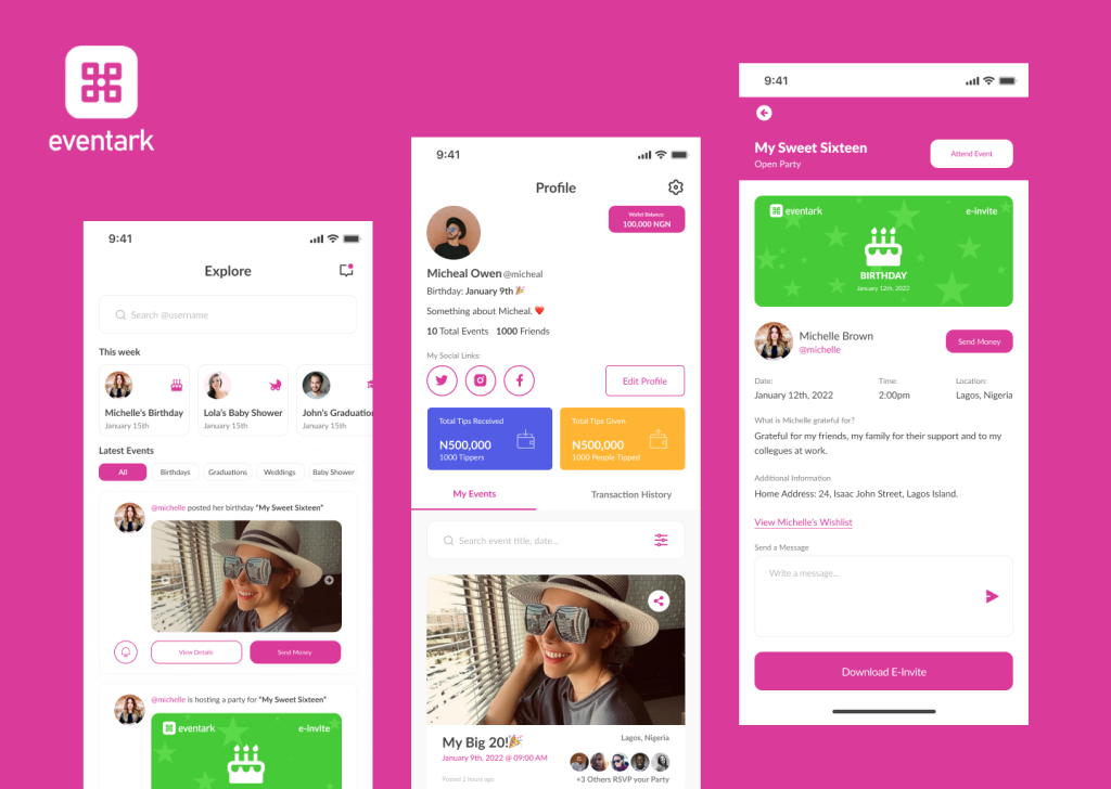
Mobile App Wireframes
UI Element / Block
Primary CTA
Accent / Highlight
Action / Alert
5 Key Screens
Flow 01 — Onboarding & Home Feed
9:41●●●
🎊
Get Started
Sign in
Onboarding
Screen 01
→
9:41●●●
🔔
🎂
Gift
New
Gift Now
♡
+
Home Feed
Screen 02
🎯 Onboarding Goal
Communicate the value prop quickly. Social proof (avatars) builds trust before sign-up. Two CTAs serve new vs returning users.
📣 Upcoming Banner
Prominent "upcoming event" nudge at the top of feed drives timely gifting action — the most important job of the home screen.
➕ FAB (Floating Button)
Centre tab bar button lets celebrants quickly create a new event — always accessible, always prominent.
Flow 02 — Create Event & Wish-list
9:41●●●
Publish
Birthday
Wedding
Baby
Grad
📷 Add Cover
EVENT NAME
DATE
LOCATION
DESCRIPTION
Add Wish-list
Accept Cash Gifts
Create Event
Screen 03
→
9:41●●●
↑
📅 Dec
📍 LDN
Wish-list
Cash Gift
Info
Gift
✓ Gifted
View
Gift
💰 Send Cash Gift
Event & Wish-list
Screen 04
🎛️ Create Event Flow
Event type selection as pills — quick, visual. Toggle switches for wish-list and cash gifting keep it simple. Cover image sets the celebration mood.
📋 Tabbed Event Page
Three tabs: Wish-list, Cash Gift, Info. Gifters immediately see what's needed. "Gifted" state prevents duplicates — a key pain point solved.
💰 Persistent Cash CTA
Send Cash Gift anchored at the bottom is always visible — ensures diaspora users with no delivery options can always participate.
Flow 03 — Gift & Celebrate
9:41●●●
£45
✉️ GIFT MESSAGE
🤝 Invite Others to Chip In
CARD
📱
🎁 Send Gift — £45
Gift Checkout
Screen 05
→
9:41●●●
🎁
Share 🎉
Home
Confirmation
Screen 06
✉️ Gift Message
Personal message wraps the gift emotionally — makes even cash gifting feel warm and intentional, not transactional.
🤝 Group Chip-In
Invite others to contribute to the same gift before sending. Solves duplicate gifting and enables bigger, more impactful presents.
🎊 Celebration Moment
Confetti + big moment on confirmation creates dopamine. "Share" CTA turns the gifter into an Eventark advocate — organic growth loop.
Design Features and Innovations
Key design decisions that shaped the platform’s success included:
Event-Centric Dashboard: A central hub that visually celebrates upcoming and past events, integrating countdowns and personalized messages to enhance emotional connection.
Wish-list Integration: Users create and share customizable wish-lists, enabling precise gift selection and reducing ambiguity.
Social Gifting Mechanism: A modular group gifting feature allows multiple contributors to pool resources toward experiences or higher-value gifts seamlessly.
Streamlined Cash Gifting: Secure, intuitive payment gateways were integrated, with clear progress indicators to reassure users during transactions.

Usability Testing
To validate design decisions, I conducted usability tests with participants matching the earlier personas. Observations revealed some confusion around managing wish-lists and understanding gift status. Based on this feedback, I introduced better visual cues such as progress indicators, tooltips, and confirmation messages.
Challenges
One notable challenge was balancing the complexity of multiple gifting options while keeping the interface streamlined. To address this, I implemented a tabbed design that allowed users to switch easily between different gift types without feeling overwhelmed. This change improved task completion rates in subsequent tests.
Another significant challenge was concerning users’ privacy preferences and cultural sensitivities around public gift disclosures. To address this, privacy controls were introduced, allowing users to determine the visibility of their gift lists and contributions. Another turning point was improving accessibility for diverse age groups; this prompted the use of cleaner typography, larger touch targets, and simplified language, aligning with WCAG guidelines.
Usability Testing
Round 1 Report · Moderated Sessions · Remote & In-Person
8 Participants · Ages 24–47
6 Tasks · 45 min sessions
February 2025 · & Lagos
6 Tasks · 45 min sessions
February 2025 · & Lagos
74.5
SUS Score "Good"
83%
Avg Task Completion
11
Issues Found
3
Critical Issues
+42
NPS Score
📋 Task Performance
| Task | Success | Progress | Errors | Status |
|---|---|---|---|---|
|
Create an Event
Add cover, date, description
|
100% |
|
0.2 | Pass |
|
Add Wish-list Items
Add 3 items from search
|
88% |
|
0.9 | Pass |
|
Share Event Link
Send to friend via WhatsApp
|
75% |
|
1.4 | Review |
|
Gift an Item
Buy from wish-list & message
|
88% |
|
0.6 | Pass |
|
Send Cash Gift
Enter amount & purpose
|
63% |
|
2.1 | Review |
|
Group Chip-In
Invite 2 others to contribute
|
50% |
|
3.3 | Fix |
⚠️ Issues Found
Group Chip-In Discoverability
6/8 users didn't find the "invite others to chip in" toggle. Buried under payment details — missed entirely.
Critical
6 of 8 users
Cash Gift "Purpose" Field Confusion
Users unsure if "purpose" is mandatory or what to write. 4 users abandoned at this step.
Critical
5 of 8 users
Share Button Not Found
3 users tapped the wrong icon to share their event. Share icon needs relabelling or repositioning.
Critical
4 of 8 users
Wish-list Item Search Slow
Product search results took 3–5s on cellular. Users assumed it had frozen and tapped again.
Medium
3 of 8 users
Event Cover Photo Cropping
Users' uploaded images were cropped unexpectedly. No preview of final crop before publishing.
Medium
2 of 8 users
Gifted State Not Prominent Enough
Small "✓ Gifted" badge wasn't seen. One user tried to re-gift an already claimed item.
Minor
2 of 8 users
Participant Quotes
"Creating the event was so easy — took me less than 2 minutes. I love that I can just send a link and people know exactly what I want."
👩🏽
Participant 3
28, Lagos · Milestone Sharer
😄
"I kept looking for where to send it to a group. The chip-in thing only appeared when I scrolled way down — I nearly missed it completely."
👨🏻
Participant 6
43, Manchester · Thoughtful Gifter
😕
"The confirmation screen was lovely — really felt like a moment. But I wasn't sure if my cash gift went through because there was no email confirmation."
👩🏾
Participant 1
35, London · Family Gifter
🤔
"The wish-list is a game changer. My husband always buys the wrong thing. I would absolutely use this for my anniversary next month."
👩🏼
Participant 2
31, Manchester · Celebrant
😍
"I didn't understand what 'purpose' meant for cash gift. Is that like a note? Should I say 'birthday'? A tooltip or example would really help here."
👨🏿
Participant 7
47, Lagos · Diaspora User
😐
"I found the share button by accident — it should probably just say 'Share Event' rather than just the upload icon. Once I found it, sharing was instant."
👩🏻
Participant 5
24, London · First-Time User
😊
🎯 SUS Score
74.5
/ 100
Grade B · "Good"
Above the industry average
of 68 for consumer apps
of 68 for consumer apps
Scale Reference
Best
100
PoorOKGoodExcellent
Net Promoter Score
1
2
3
4
6
7
8
9
9
10
● 5 Promoters
● 3 Passives
● 2 Detractors
NPS = +42
🔥 Confusion Heatmap
Where did participants struggle most? Each cell = avg errors per participant per screen.
P1–P2
P3–P4
P5–P6
P7–P8
Onboarding
0.2
0.1
0.3
0.2
Create Event
0.4
0.2
0.8
0.3
Wish-list
0.9
0.5
0.4
1.1
Share Event
1.4
2.0
1.2
1.6
Cash Gift
2.3
1.7
2.6
3.0
Chip-In
3.4
2.9
3.8
4.1
Low
High errors
✅ Recommendations
1
Elevate Group Chip-In. Move "Invite others" feature to a prominent card above the payment form. Add a short explainer tooltip.
2
Rename & explain "Purpose". Replace label with "What's this for?" and add 3 autofill examples: Birthday, House Fund, Trip.
3
Relabel Share button. Change icon-only to "Share Event" with text label. Add a bottom sheet confirmation on share.
4
Add loading skeleton. Show skeleton cards on wish-list search to reassure users during 3–5s load on cellular.
5
Email + in-app confirmation. Send a receipt after cash gift with gift message, amount, and recipient's name.
6
Enhance "Gifted" state. Use a full greyed-out card with strikethrough and a prominent checkmark badge to prevent re-gifting.
Impact
The final version of the Eventark UI achieved a smooth, user-friendly experience supporting diverse gifting scenarios. The design fostered emotional connection by emphasizing personalization and celebration, demonstrated through customizable event pages and wish-list items.
By aligning design decisions with user needs and applying structured user testing, the platform effectively reduced friction in gift selection and event sharing. This not only helped users feel more engaged but also increased the likelihood of platform adoption and repeat use.
Post-launch analytics revealed increased engagement, with a notable rise in average gift contributions per event and positive user sentiment reflected in reviews. The platform’s social features fostered a greater sense of community and celebration, aligning with Eventark’s core mission. Continuous monitoring and feedback mechanisms were established to inform future updates.
Conclusion
My work on the design for Eventark highlights the importance of empathy-driven research, iterative design, and usability validation. Through a clear understanding of user goals and challenges, I was able to create an interface that balances simplicity and functionality.
Key lessons include prototyping early and often, prioritizing clarity in navigation, and providing meaningful feedback to users.
BidBuddyapp – Gamifying Ecommerce
UI, UX Design, Mobile
Readeo - Video Chat meets Children Books
UI, UX Design, Web