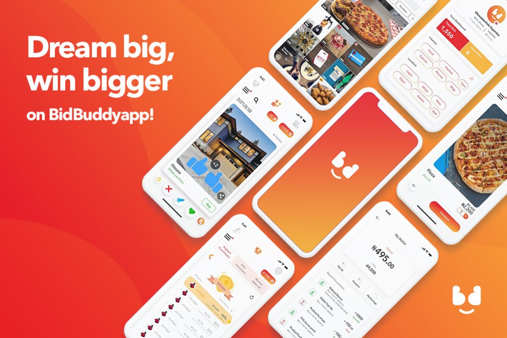
BidBuddyapp - Gamifying Ecommerce
Mobile App Design
BidBuddyapp - Gamifying Ecommerce
A mobile app for a social bidding platform that “gamifies eCommerce”.
The app should provide interactive bidding on products, services, and experiences between consumers and merchants. Prioritize good usability, aesthetics, interaction, consideration for first-time users.
Work
UI, UX Design, Case Study, User Research, Wireframing, Visual Design, Mobile
Case Study Location
Nigeria
Website
https://bidbuddy.app
Understanding the Challenge:
Just like traditional commerce and commercial transactions have evolved over the years to accommodate an increasingly digital and borderless lifestyle, so has e-Commerce.
There are about 400 million internet users in Africa who are potential customers and thousands of e-Commerce platforms offering a wide range of products, services, and experiences. We find that most of these platforms end up competing with each other in a market saturated with similarities despite the growing number of potential customers.
To stand out from this crowd requires in-depth knowledge of the shopping habits of the customers and a model that is different from the common online marketplace.
How does this platform help?
- Customer-centric Entertainment: It contains aspects of open market bargaining, auction, gaming, and Business-to-Customer. By tapping into the competitive nature of most shoppers, the app recreates the excitement and adrenaline rush that most people experience when they are in the market rushing for that last discounted item.
- Visibility for Every Merchant: The interactive and engaging nature of this model is great for the numerous online merchants competing for visibility on e-Commerce platforms. The app exposes every merchant to active users that log on to the application daily to search for and bid for the best deals. Every merchant’s product is very likely to be seen by at least 1000 registered users every day.
- More Sales: This is better than waiting for customers to visit a website only when they need to go shopping and discover your product by chance. It is better than competing for prices with the open market.
My Role
I was the primary designer for this product
Process
The Research
I conducted user research mainly with people who shopped online. The purpose was to determine what the users think and if the product will be usable. Learning about the problems of potential users is a great way to be inspired and motivated. Working with real-world data is a good starting point to help avoid guesswork and preconceptions. Using this information provided a better chance to solve the greater problem.
Personas
The results of my user interview show that the users are willing to have a product that would ease their stress during online shopping, and also look. The accumulation of the different insights and common patterns that came from the users’ answers helped me create three personas which are the manifestation of that data in a character. Two of the personas presented edge cases since they were based on certain needs of some of the participants. Eventually, I focused on the more common persona.
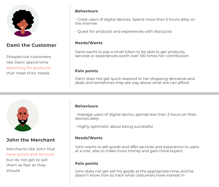
From my personas I was able to conclude on what:
The customer will need from the product:
- View various products according to their interest
- View discount prices from different products
- Have knowledge about who each product is
- Top up wallet
- Be able to place bids on products using like or dislike
- Be able to view leaderboard of bidders
- And finally be able to buy products outrightly
The merchants will need from the product:
- Upload various products according to their interest
- Add discount prices from different products
- Set product run timer
- See users interests based on likes or dislikes
- See winners list
- Receive payment
Focusing on a specific user helps to keep their needs in mind and not get distracted whenever an idea for a new feature or demand pops up.
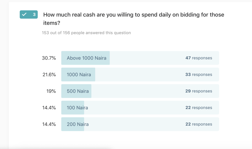
Survey
I carried out a survey to get more insight into people and how they manage their subscription. Through the survey, we were able to analyze the current e-commerce experience of the users: by asking different questions
From the survey I was able to Deduce:
- Consumers have to two or three e-commerce services on average
- Users would like a way to crowdfund e-commerce or purchase of an item. (78%)
- Users are willing to pay an average of 500 naira and above on bidding for an item
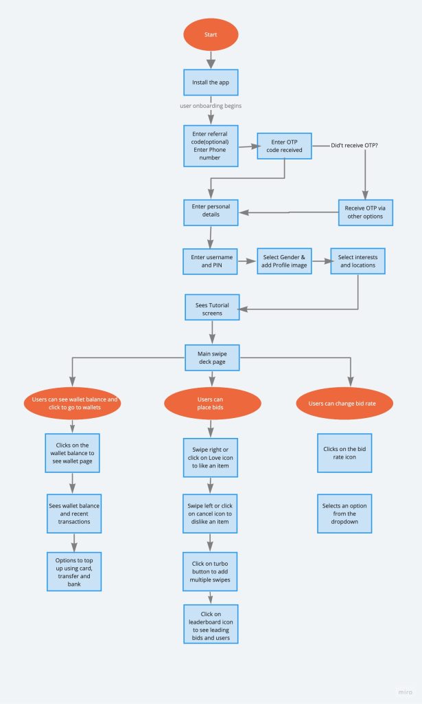
User Flowchart
Up until now, I had a vague idea of how the app will function. Mapping the basic flow of the app forced me to figure each step on the path the users will take throughout the solution. I first sketched it on paper and then digitally rendered it using miro.com.
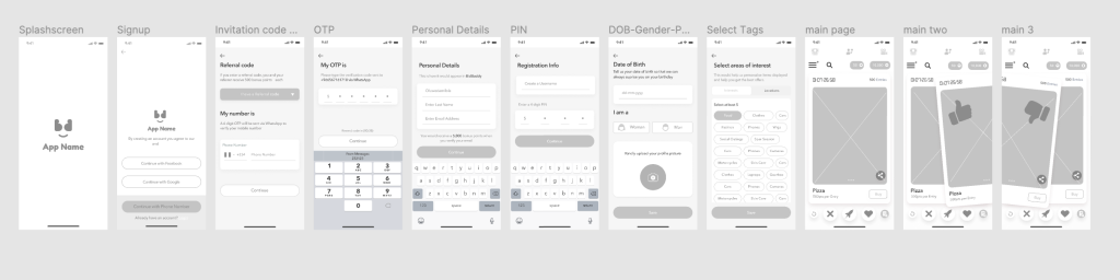
Low Fidelity
This visual guide represents the skeletal framework of the app. It helped me arrange the interface elements while I focused on the functionality rather than what it looks like. Moreover, the simplicity of wireframes allows me to quickly test ideas without diving into the details.
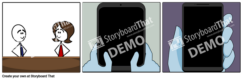
Storyboard — Using The App
I created a storyboard describing my user’s experience with the app. This is a great tool to explore how the product will be used in a larger context as if it was a part of a bigger narrative. It’s an effective and inexpensive way to capture, relate, and explore the app in a real-world setting. I created a storyboard describing my user’s experience with the app. This study helps to understand the circumstances and the larger context in which the app will be used.
Visual Research
Inspiration
Before getting started with the visual design I did thorough research to get inspirations. The purpose was to learn about the visual world and gathering inspiration from other voting apps.
Iteration
Next, I explored different design possibilities: From each repetition of the design I learn something that I can use for the next iteration.
The Design
Guidelines established for the high-fidelity prototype:
- Less cognitive load, the better.
- Cleaner looks with exciting colour to make the app look gamified.
- Contextualized help should be provided based on where the user is. It should account for a new and repeating user.
- The colours chosen should be accessible by AAA standards.
I designed the app using Material Design for Android and following the IOS Design guidelines for ios.
User Onboarding
After doing some usability testing, the final high-fidelity prototype is explained in the following steps:
- Tutorial Screens
- Swipe deck Screens and Leaderboard
- Product search and explore
- Error flow and miscellaneous
Tutorial Screens:
The user needs to fully understand how to successfully indicate like or dislike on a product
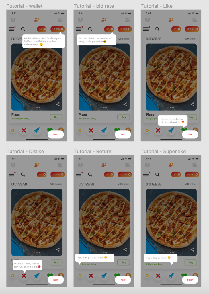
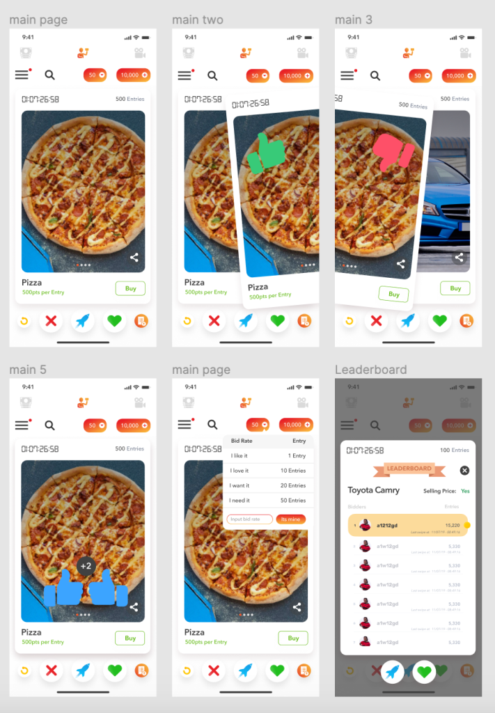
Swipe Deck and Leaderboard:
This step mirrors the Tinder dating app. The users can swipe right or left and also super like an item. They could also view the products’ details.
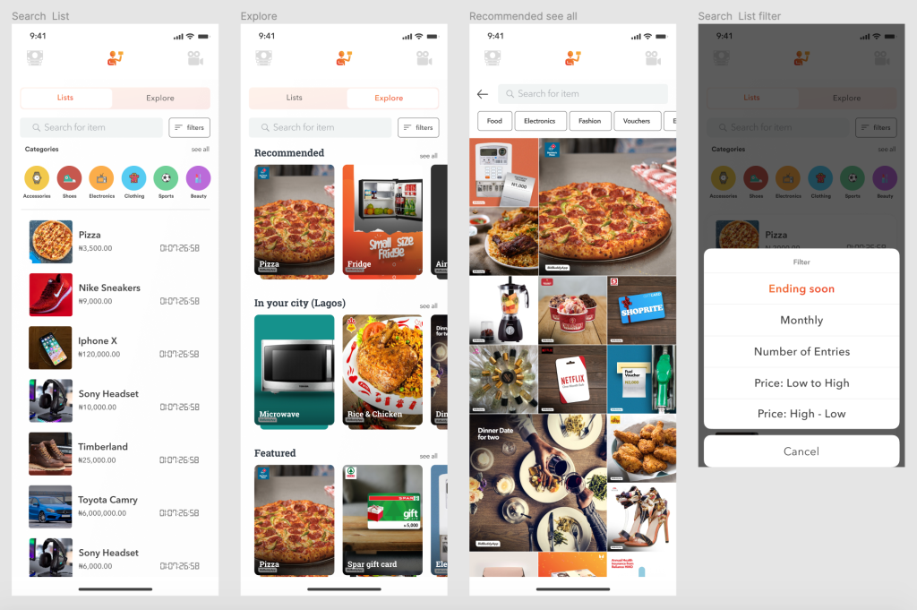
Product Search and Explore page:
The user can search for a particular item from the product list or decide to go through the explore page
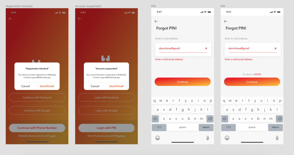
Error state and miscellaneous:
The error state will be shown when a user inputs incorrect login credentials or if they perform any fraudulent act on the app, their account will be temporarily deactivated.
Conclusion
What did I learn?
Designing the app has been a challenging and rewarding journey. I understood the needs of the users through the survey and conversations. Finally, I faced the challenge of creating an engaging app both from the user experience perspective and the visual perspective.
What are the next steps?
- Deep research about specific features
- Usability test of the prototype with users
- Improve user flow
Future Features
- Ability to turbo burst you on leaderboard.
- Ability to watch adverts and earn
Final Thoughts
BidBuddyapp is a social bidding platform that “gamifies eCommerce” giving users the opportunity to interactively bid on products, services, and experiences.
Being able to measure user’s direct interest and because of the data we gather during registration, we can infer what users want, where they are making the bids from, level of interest, etc.
TESTIMONIALS
BidBuddyapp - Gamifying Ecommerce
Working with Dami on the BidBuddyApp design was an absolute game-changer. Her ability to translate our vision into a clean, intuitive, and scalable user experience exceeded all expectations. She crafted a seamless journey that balanced functionality with aesthetic appeal. Her attention to detail, user empathy, and design thinking elevated our product significantly. I highly recommend her for any UI/UX design project where excellence is non-negotiable.
Henry Obinugwu
Co-Founder
JupiterX Movers
UI, UX Design, Social Media Management
JupiterX Construction & Engineering
UI, UX Design, Social Media Management