KoinNG – P2P Cryptocurrency Exchange
Fintech / Cryptocurrency
KoinNG – P2P Cryptocurrency Exchange"
KoinNG is a peer-to-peer (P2P) cryptocurrency exchange designed to enable users to buy, sell, and trade digital assets securely and efficiently. The platform operates in a high-risk, trust-sensitive fintech environment where user confidence, clarity, and speed are critical to adoption and retention.
Work
UI Design, User Experience Design, User Research, Wireframing, Afinnity Diagram, Usability Testing, Crazy 8’s method, Sketching
The Challenge
Peer-to-peer crypto platforms often assume a high level of user knowledge. During early discovery, it became clear that this assumption was a major barrier for adoption. New users struggled to understand how escrow worked, when their funds were safe, and what actions were required at each stage of a transaction. Even experienced users reported frustration with cluttered interfaces and unclear transaction states.
The existing experience lacked clarity, reassurance, and flow. Users frequently hesitated mid-transaction, which increased drop-offs and support requests.
Cryptocurrency adoption continues to grow, but P2P exchanges face unique UX challenges, especially in emerging markets:
Low trust in online financial platforms
Fear of scams and fraud
Complex trading flows that intimidate new users
Poor clarity around escrow, dispute resolution, and transaction status
Overloaded interfaces that prioritise features over usability
KoinNG needed a product experience that could:
Build instant trust with first-time users
Simplify complex crypto trading workflows
Support both beginners and experienced traders
Reduce user errors and abandoned transactions
Understanding the Users
To understand user needs, I conducted stakeholder interviews, reviewed existing product feedback, and analysed competitor P2P exchanges. I also spoke directly with potential users, including first-time crypto traders and frequent P2P traders.
A clear pattern emerged. Users were not primarily looking for more features; they wanted clarity, transparency, and reassurance. First-time users needed guidance and plain language. Experienced users wanted efficiency, but not at the cost of reliability. Across both groups, trust signals mattered more than visual flair.
Research & Discovery
User Research Approach
To deeply understand user needs and pain points, I used a mixed-method research approach:
Stakeholder interviews with the product team
Competitive analysis of existing P2P exchanges
User interviews with crypto traders and first-time users
Review of support tickets and common transaction complaints
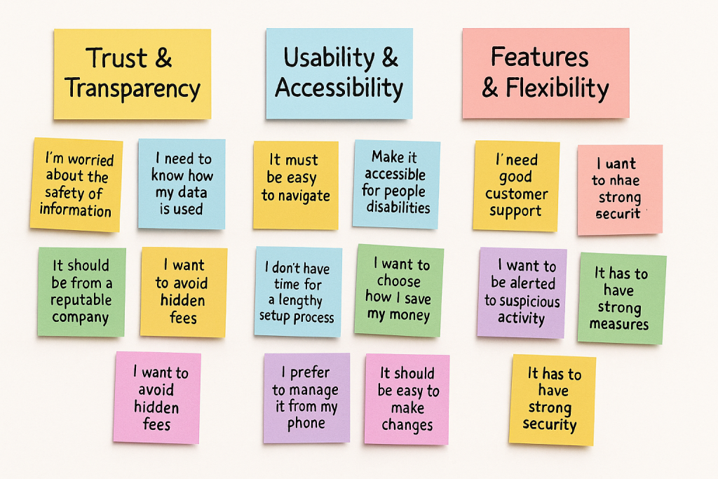
Key User Insights
From research, several patterns emerged:
Users feared making irreversible mistakes during trades
Many users did not fully understand how escrow worked
Trust signals mattered more than advanced features
Users wanted transparency at every transaction stage
New users needed guidance without feeling overwhelmed
01
Research Overview & Objectives
FOUNDATION
🎯 Research Objectives
→
Uncover the primary trust signals and friction points that determine whether a user completes their first P2P trade on KoinNG.
Drives onboarding & verification UX design
→
Understand how users assess counterparty risk during a trade — and what safety mechanisms increase confidence to transact.
Informs escrow, reputation & dispute systems
→
Map the mental models users bring to crypto pricing, fees, and exchange rates in a P2P context versus centralised exchanges.
Shapes pricing transparency & rate display features
→
Identify the abandonment triggers — at what point and why do users drop off during the buy/sell flow.
Targets conversion rate optimisation
→
Explore the role of community, social proof, and word-of-mouth in crypto platform adoption among target demographics.
Drives growth & referral strategy
📍 Scope
GEOGRAPHY
Lagos · Abuja · Port Harcourt
+ London · Manchester (diaspora)
+ London · Manchester (diaspora)
AGE RANGE
18 – 45 years
CRYPTO EXPERIENCE
Novice → Advanced
DEVICE
Mobile-first (Android 80%)
SCOPE DEFINITION · Q1 2025
⚡ Risk Context
Trust & Safety
P2P scam exposure is high. Users carry significant past trauma from bad trades.
Regulatory
CBN restrictions create anxiety around fiat on/off ramps. KYC friction is a real barrier.
Volatility
Naira instability drives crypto adoption but also creates timing anxiety during trades.
HIGH-SENSITIVITY CONTEXT
54
Total participants across all research methods
10
Weeks of research across 5 phases
18
Key insights distilled from raw data
6
Critical design opportunities identified
02
Research Phases
10 WEEKS
PHASE 01
Discovery & Landscape
Wk 1–2
◆ Desk Research
◆ Competitor Analysis
◆ Analytics Review
◆ Stakeholder Interviews
→ Research brief
→ Competitor matrix
→ Hypothesis list
→ Competitor matrix
→ Hypothesis list
PHASE 02
Qualitative Depth
Wk 3–5
◆ In-depth Interviews (IDIs)
◆ Contextual Enquiry
◆ Diary Studies
◆ Cognitive Walkthrough
→ Interview transcripts
→ Affinity diagram
→ Journey maps
→ Affinity diagram
→ Journey maps
PHASE 03
Quantitative Validation
Wk 5–7
◆ Survey (n=32)
◆ Card Sorting
◆ Tree Testing
◆ Funnel Analytics
→ Survey report
→ IA recommendations
→ Drop-off analysis
→ IA recommendations
→ Drop-off analysis
PHASE 04
Usability & Testing
Wk 7–9
◆ Moderated UT (n=8)
◆ Unmoderated UT (n=6)
◆ Think-Aloud Protocol
◆ Eye-Tracking (remote)
→ Usability report
→ Issue severity matrix
→ Video highlights reel
→ Issue severity matrix
→ Video highlights reel
PHASE 05
Synthesis & Delivery
Wk 9–10
◆ Affinity Mapping
◆ Insight Clustering
◆ Opportunity Mapping
◆ Readout Presentation
→ Research report
→ Design principles
→ Backlog tickets
→ Design principles
→ Backlog tickets
03
Research Methods
MIXED METHODS
🎤
In-Depth Interviews (IDIs)
1-on-1 semi-structured conversations (45–60 min) exploring trust, mental models, and emotional journeys around crypto trading.
◆n=14 participants (8 Nigeria, 6 diaspora UK)
◆Remote via Zoom + in-person Lagos field sessions
◆Screen recording + think-aloud on mobile
◆Recorded, transcribed, and thematically coded
QUAL
WK 3–4
PRIMARY
📋
Survey (Online Quantitative)
Structured online survey distributed across crypto Telegram groups and Twitter/X — validating qualitative themes at scale.
◆n=32 completed responses (screened)
◆Likert scales on trust, speed, fees, safety
◆NPS + platform comparison questions
◆Distributed via Typeform · Google Forms
QUANT
WK 5–6
VALIDATION
🗂️
Card Sorting & Tree Testing
Open and closed card sorts to understand how users mentally organise crypto features — informing IA and navigation hierarchy.
◆n=18 card sort participants (online, unmoderated)
◆30 cards covering features, labels, actions
◆Tree test on proposed IA with success metrics
◆Optimal Workshop tool
QUANT
WK 6
IA
📱
Moderated Usability Testing
Task-based usability sessions on mid-fidelity prototype — watching real users attempt key flows like onboarding, buying, and dispute raising.
◆n=8 moderated (45 min per session)
◆6 core tasks covering full user journey
◆Think-aloud + eye-tracking (Lookback.io)
◆SUS score + task completion metrics
QUAL
WK 7–8
USABILITY
📓
Diary Study
10-day longitudinal diary capturing real trading moments, anxieties, and platform-switching behaviour in participants' natural context.
◆n=8 active crypto traders over 10 days
◆Daily prompts via WhatsApp voice notes
◆Screenshot submissions of competitor apps used
◆Captured emotional highs/lows during trades
QUAL
WK 3–5
LONGITUDINAL
🔍
Contextual Enquiry
Observed users in their natural environment — at home, on mobile data, in noisy conditions — to reveal real-world performance and context constraints.
◆n=6 field sessions in Lagos + Abuja
◆Observed across 3 scenarios: buy, sell, dispute
◆Physical environment notes (bandwidth, lighting)
◆Companion app switching behaviour captured
QUAL
WK 4–5
FIELD
04
Participant Segments & Screener
54 PARTICIPANTS
👥 User Segments
🔰
Crypto Curious
Aware of crypto, never traded. High anxiety around scams and complexity. Motivated by Naira devaluation.
n=12
📈
Active P2P Trader
Trades weekly on platforms like Binance P2P, Bybit. Has strong opinions on fees, speed, and counterparty trust.
n=18
🌍
Diaspora Remittance User
UK/US-based Nigerians sending money home via crypto as a cheaper alternative to Western Union or bank transfers.
n=10
🏪
SME / Business Trader
Small business owners using crypto to pay suppliers abroad or hedge against Naira volatility. Volume-sensitive.
n=8
⚠️
Burned / Lapsed User
Previously traded and had a negative experience — scam, locked funds, or poor dispute resolution. High trust deficit.
n=6
📝 Screener Questions
All interview and usability test participants were screened using the following criteria to ensure relevance and diversity of perspective.
Have you ever bought, sold, or attempted to trade cryptocurrency in the past 12 months? [Must answer Yes or No — both eligible]
Which platforms have you used to buy or sell crypto? [Multi-select: Binance, Bybit, Luno, LocalBitcoins, Other, None]
How would you rate your confidence when trading on a P2P platform? [1 = Very unconfident → 5 = Very confident]
Have you ever experienced a problem with a crypto transaction — scam, frozen funds, or dispute? [Yes / No / Prefer not to say]
How often do you send money to Nigeria or receive money from abroad? [Diaspora segment screener]
What is your primary device for crypto trading? [Android / iPhone / Laptop / Desktop]
Are you aged 18–45, and comfortable being recorded during a research session? [Consent + eligibility confirmation]
How important are each of the following when choosing a P2P platform: Speed / Fees / Security / Reputation? [Rank order — used for segment targeting]
05
IDI Discussion Guide (Abridged)
45 MIN SESSION
01 Warm-Up & Background
5 min
Tell me a bit about yourself — what do you do for work and how did you first hear about cryptocurrency?
What role does your phone play in your financial life day-to-day?
How do you currently send or receive money — do you use bank transfer, mobile money, or anything else?
02 Crypto Mental Models
10 min
When you think about buying crypto, what's the first thing that comes to mind — the process, the risk, something else?
How do you decide on a "good" exchange rate when you're about to trade? What do you compare it to?
Can you walk me through the last time you bought or sold crypto — what happened step by step?
What does "trust" mean to you on a crypto platform? What makes you feel safe — or unsafe?
03 P2P Trading Experience
12 min
Have you ever used a P2P platform? What was your experience like — what went well, what felt risky?
When you're about to trade with a stranger on P2P, what do you look at to decide if you trust them?
Tell me about a time a trade went wrong — or a time you almost traded but didn't go through with it. What happened?
If a trade dispute happened — what would make you feel the platform was on your side?
04 KoinNG Prototype Reaction
12 min
I'm going to show you an app — just react naturally. What's your first impression when you see this screen?
Can you try to find where you'd go to buy USDT — talk me through what you're thinking as you go.
What would make you feel confident enough to actually complete a trade here for the first time?
Is there anything on this screen that confuses you, feels unnecessary, or is missing entirely?
05 Ideal Platform & Priorities
6 min
If you could design a perfect P2P crypto platform for someone like you — what are the three most important things it would have?
What would make you recommend KoinNG to a friend? What would make you warn a friend away from it?
Is there anything important about your crypto experience we haven't talked about that you'd want us to know?
06 Close & Wrap-Up
5 min
On a scale of 1–10, how likely would you be to use KoinNG based on what you've seen today, and why that number?
Is there anyone else you think we should speak to — a friend, family member, or colleague who has a different crypto experience to yours?
Thank you so much — is there anything you'd like to ask us before we finish?
06
Key Research Insights
18 INSIGHTS
INSIGHT 01 · TRUST
Trust is Built on People, Not Platforms
Users don't trust platforms — they trust people and track records. Trader reputation (reviews, completion rate, response time) is more influential than brand credibility for P2P trade decisions.
PARTICIPANT QUOTE
"I look at how many trades they've done. If it's below 100, I'm not touching it. I don't care what app it's on."
CRITICAL
11 / 14 IDI participants
INSIGHT 02 · SPEED
30-Minute Rule: Speed Defines Trust
Users expect trade confirmation within 30 minutes. Anything beyond this triggers anxiety and platform-switching. Speed is treated as a proxy for legitimacy — slow = suspicious.
DIARY STUDY OBSERVATION
"After 20 minutes I started sweating. I thought they'd disappeared with my money. I'll never use that seller again."
HIGH
Survey: 78% agreed
INSIGHT 03 · ONBOARDING
KYC is the Biggest Drop-Off Point
Identity verification causes the most abandonment. Users perceive multi-step KYC as either a scam trap or government surveillance — especially post-CBN restrictions. They need transparent explanation of why each step is needed.
FUNNEL ANALYTICS
"63% of sign-ups drop off at the BVN / NIN verification step — the highest abandonment point in the entire flow."
CRITICAL
Analytics + 9 / 14 IDIs
INSIGHT 04 · RATES
Rate Comparison is a Daily Ritual
Active traders check rates on 3–5 platforms before committing. KoinNG's rate display is not prominent or comparable enough — users leave the app to check competitors before returning (if they return at all).
CONTEXTUAL ENQUIRY
"I always open Binance first to see the rate, then I check here. If it's more than ₦20 difference, I just use Binance."
HIGH
6 / 6 contextual sessions
INSIGHT 05 · DIASPORA
Diaspora Users Need a "Remittance Framing"
UK-based Nigerians don't think of themselves as "crypto traders" — they think of themselves as people sending money home. KoinNG's crypto-first language alienates them. They need a remittance-led narrative to feel the platform is for them.
IDI — DIASPORA PARTICIPANT
"I don't care about USDT or BTC. I just want to send my mum money and not lose 15% to Wise."
MEDIUM
8 / 10 diaspora participants
INSIGHT 06 · ESCROW
Escrow is Trusted but Not Understood
Users who understand escrow feel dramatically more confident. But only 34% of survey respondents correctly described how escrow works. The concept needs to be demystified — ideally with a plain-language visual explainer during onboarding.
SURVEY FINDING
"Once they told me my money was locked — that no one could touch it until I confirmed — I felt much calmer. I just didn't know it worked like that."
HIGH
Survey: 34% understood escrow
INSIGHT 07 · DISPUTE
Dispute Resolution Terrifies Users More Than Scams
The fear is not just being scammed — it's being stuck with no recourse. Users want human support, not bots. 68% said they'd switch platforms if a dispute wasn't resolved within 2 hours by a real agent.
IDI — BURNED SEGMENT
"A bot told me to wait 72 hours. My money was gone. I just accepted it. That's why I don't trust any of them."
CRITICAL
Burned segment + survey
INSIGHT 08 · SOCIAL
WhatsApp is the Real Referral Engine
100% of active traders said they found their current platform through a WhatsApp group or friend recommendation. No one cited an advert. Word-of-mouth in community groups is the dominant acquisition channel — KoinNG needs a shareable, social-proof moment baked into the product.
IDI — MULTIPLE PARTICIPANTS
"My guy in our trading group said to use it, so I did. He'd done 500 trades on it. That's enough for me."
STRATEGIC
14 / 14 IDI participants
INSIGHT 09 · MOBILE
Low-Bandwidth Reality Shapes UX Needs
Contextual enquiry revealed that 5 of 6 Lagos users traded on 3G or weak 4G. Heavy screens, large images, and unoptimised assets caused rage-taps and abandonment. Performance is a UX and trust issue — a slow app feels unsafe.
CONTEXTUAL ENQUIRY OBSERVATION
"When the page takes time to load I think something is wrong. I close it. I'll try again later — or I won't."
CRITICAL
5 / 6 field sessions
07
Affinity Mapping — Theme Clusters
SYNTHESISED
Trust & Safety
22 notes
"I need to know my money can't disappear"
Reputation badges matter more than brand name
"Green tick" on verified sellers builds confidence
Escrow explained = immediate relief
Past scam trauma shapes every decision
Speed & Performance
18 notes
30-min expectation for trade completion
"Slow app = something is wrong"
Countdown timers reduce anxiety during escrow
Network issues blamed on platform, not signal
Loading spinners without feedback cause drop-off
Clarity & Transparency
16 notes
Hidden fees destroy trust immediately
"Show me the total before I commit"
Rate shown must match what they receive
Plain English > crypto jargon always
KYC steps need "why we need this" explanation
Community & Social
14 notes
WhatsApp groups = trust network for referrals
"My friend uses it" is enough to try it
Trader chat builds rapport before money moves
Visible trade volume = social proof signal
Referral rewards feel like shared wins
08
How Might We + Design Opportunities
6 OPPORTUNITIES
💡 How Might We Questions
HMW
How might we make trader reputation so visible and credible that first-time users feel safe transacting with strangers?
HMW
How might we demystify escrow in under 10 seconds so every new user understands their money is protected before they trade?
HMW
How might we reduce KYC abandonment by making identity verification feel safe, fast, and purposeful rather than intrusive?
HMW
How might we build a rate display so competitive and clear that users never feel the need to open a competitor app to compare?
HMW
How might we reframe KoinNG for diaspora users as "the fastest way to send money home" rather than a crypto trading platform?
HMW
How might we turn every completed trade into a shareable social moment that naturally pulls friends and community into the platform?
🚀 Prioritised Design Opportunities
P1
Trust-First Trader Profile System
Prominent reputation cards with completion rate, response time, star rating, and verified badge. Shown before any trade commitment.
HIGH IMPACT · LOW EFFORT
P1
Escrow Explainer Onboarding Card
Single animated card shown during first trade: "Your ₦ is locked safely — it only moves when you say so." With tap-to-learn more.
HIGH IMPACT · LOW EFFORT
P2
Progressive KYC with Context
Break KYC into micro-steps with clear "why we need this" copy for each. Show trade limits unlocked at each tier to create incentive.
HIGH IMPACT · MED EFFORT
P2
Live Rate Comparison Widget
In-app rate comparison showing KoinNG vs. market average. Removes need to leave the app — increases conversion and retention.
MED IMPACT · MED EFFORT
P3
Diaspora "Send Home" Landing Mode
Alternate app entry for diaspora users — remittance-framed UI showing GBP → NGN equivalent and delivery time, not crypto terminology.
MED IMPACT · HIGH EFFORT
P3
Social Proof Trade Completion Moment
Shareable "trade complete" card with trade volume and star rating. Native share to WhatsApp — turns users into organic brand advocates.
MED IMPACT · LOW EFFORT
09
Success Metrics & Measurement Plan
KPIs
🎯 Trust & Safety Metrics
First Trade Completion Rate
% of verified users who complete their first trade within 7 days of KYC
>65%
Dispute Resolution CSAT
User satisfaction score after a dispute is resolved (1–5 scale)
>4.0
Repeat Trade Rate (30d)
% of first-time traders who trade again within 30 days
>55%
⚡ Onboarding & Activation
KYC Completion Rate
% of sign-ups who complete full identity verification
>70%
Time to First Trade
Median hours from sign-up to first completed trade
<48h
Onboarding Drop-off Rate
% of users who abandon during KYC flow (target: reduce by 40%)
<30%
📊 Platform Health
Net Promoter Score (NPS)
Surveyed monthly — target promoter growth driven by trust improvements
>+50
Avg Trade Resolution Time
Median minutes from trade initiation to funds confirmed
<20m
Referral Conversion Rate
% of referred users (via share link) who complete KYC and first trade
>35%
10
10-Week Research Timeline
GANTT
Activity
Wk 1
Wk 2
Wk 3
Wk 4
Wk 5
Wk 6
Wk 7
Wk 8
Desk Research
▓
▓
Stakeholder Interviews
▓
▓
Participant Recruitment
▓
▓
In-Depth Interviews
▓
▓
Diary Study
▓
▓
▓
Contextual Enquiry
▓
▓
Online Survey
▓
▓
Card Sort / Tree Test
▓
Usability Testing
▓
▓
Synthesis & Reporting
REPORT
Defining the Product Approach
Based on research, I defined a design approach grounded in three core principles: trust, simplicity, and guidance.
Trust was addressed by making every transaction state visible and understandable. Users could clearly see when funds were in escrow, when actions were required, and what protections were in place. Simplicity guided the layout and information hierarchy, ensuring that each screen focused on one primary action. Guidance was embedded subtly through microcopy, progress indicators, and contextual prompts rather than intrusive tutorials.
1. Trust
Trust was built visually and structurally through:
Clear status indicators
Transparent transaction steps
Consistent use of confirmations
Calm, professional UI language
2. Simplicity
Instead of exposing all features at once:
Key actions were prioritised
Secondary features were progressively disclosed
Each screen focused on one primary task
3. Guidance
The experience balanced guidance and speed by:
Using tooltips and microcopy
Providing clear error prevention messages
Showing progress at every stage
This approach allowed the product to support beginners without slowing down advanced users.
Designing the User Experience
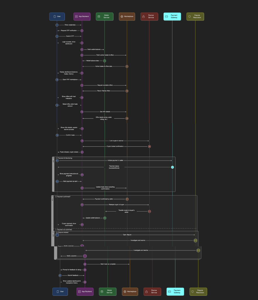
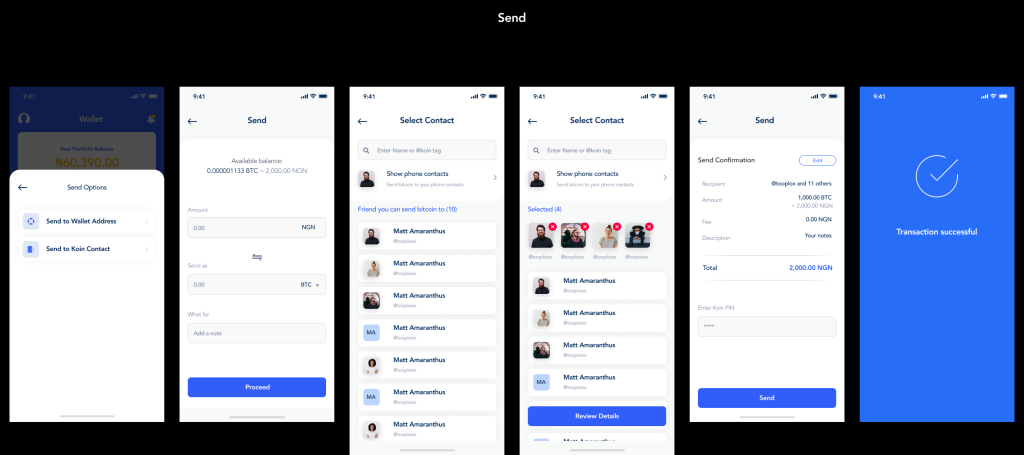
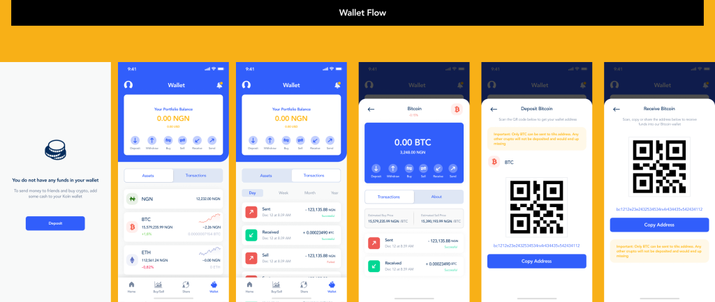
I began by mapping the full end-to-end P2P trading journey, from onboarding to trade completion and dispute resolution. This helped identify friction points and moments of uncertainty where users were most likely to abandon the process.
The trading flow was redesigned to be linear and predictable. Each step clearly communicated what the user needed to do, what was happening behind the scenes, and what would happen next. Critical actions, such as confirming payment or releasing funds, were supported with clear explanations and confirmation states to reduce errors.
Wireframes were developed to test layout, content hierarchy, and interaction patterns before moving into high-fidelity design. Early usability testing helped refine button placement, wording, and error prevention mechanisms.
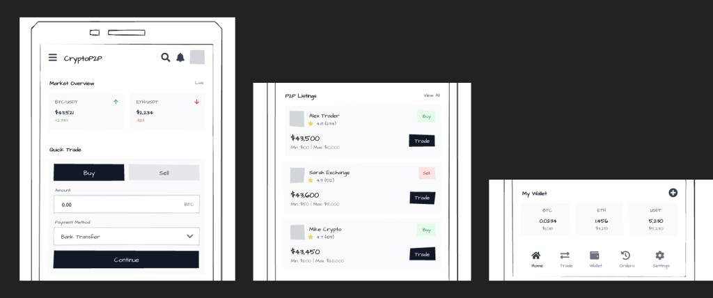
I designed the core P2P trading flow to ensure users always knew:
Where they were
What action was required
What would happen next
Key flows designed:
Account onboarding
Wallet funding
P2P buy/sell flow
Escrow confirmation
Dispute resolution entry point
Information Architecture Design
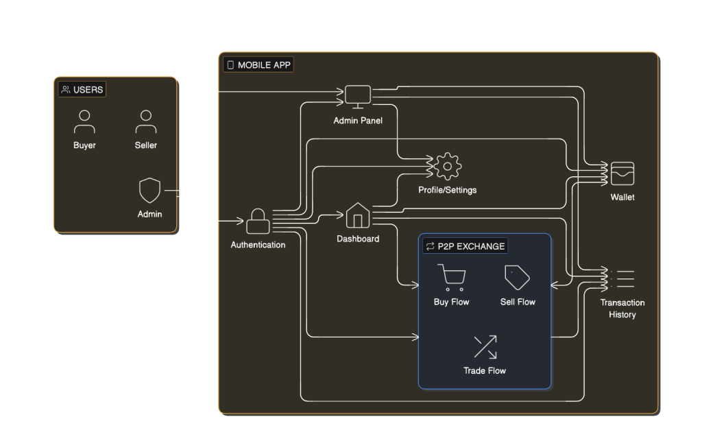
Wireframing & Interaction Design
Low-fidelity wireframes were created to validate structure and flow before visual design.
During this phase, I focused on:
Reducing steps required to complete a trade
Improving readability of financial information
Ensuring CTA clarity
Preventing costly user errors
Usability checks were done with sample users to refine:
Button placement
Form layout
Error handling
Visual Design & Interface Decisions
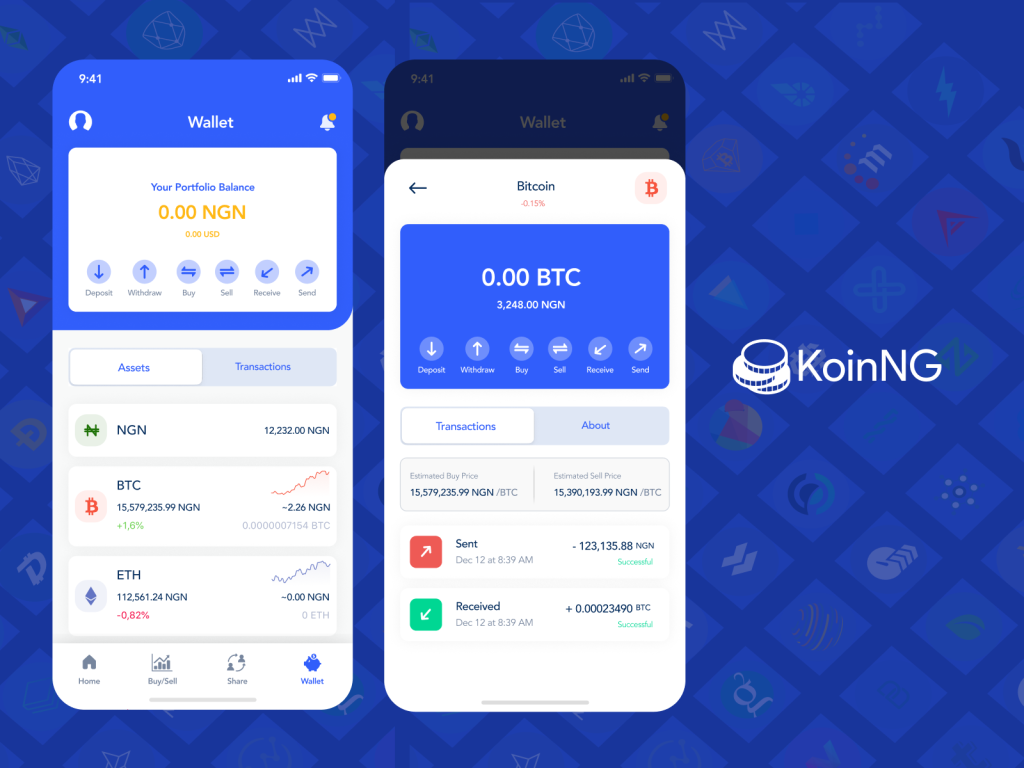
The visual design aimed to reinforce trust and professionalism. I used a clean, minimal interface with a neutral colour palette, allowing important actions and transaction statuses to stand out clearly. Typography was carefully chosen to improve readability, especially for financial information.
Status indicators played a major role in the interface. Users could easily distinguish between pending, completed, and disputed transactions at a glance. Success and warning messages were written in calm, reassuring language rather than technical jargon, reducing anxiety during high-stakes actions.
The final interface balanced clarity and efficiency, ensuring the product felt credible without being intimidating.
Accessibility was considered throughout the design process. High colour contrast improved readability, especially on mobile devices. Language was kept simple and direct to support users with varying levels of technical knowledge. Interactive elements were designed with sufficient spacing to reduce accidental actions, particularly during financial transactions.
Results and Impact
The redesigned experience significantly improved how users interacted with the platform. Stakeholders reported fewer questions around escrow and transaction status, and early user feedback highlighted increased confidence when completing trades. Users described the platform as “clear,” “reassuring,” and “easy to understand,” even when using a P2P exchange for the first time.
Although detailed metrics were confidential, the product team observed smoother transaction flows and reduced friction during onboarding and trade completion.
Conclusion
This project reinforced the importance of designing for emotional as well as functional needs. In financial products, trust is a usability requirement. Small design decisions, such as clearer microcopy or better progress feedback, can significantly change how safe a user feels.
Working on KoinNG strengthened my ability to design complex systems in a way that feels human, calm, and accessible, skills I continue to apply across fintech, edtech, and multi-sector digital products.
BidBuddyapp – Gamifying Ecommerce
UI, UX Design, Mobile
Shecluded - Female Exclusive Loan Product
UI, UX Design, Web