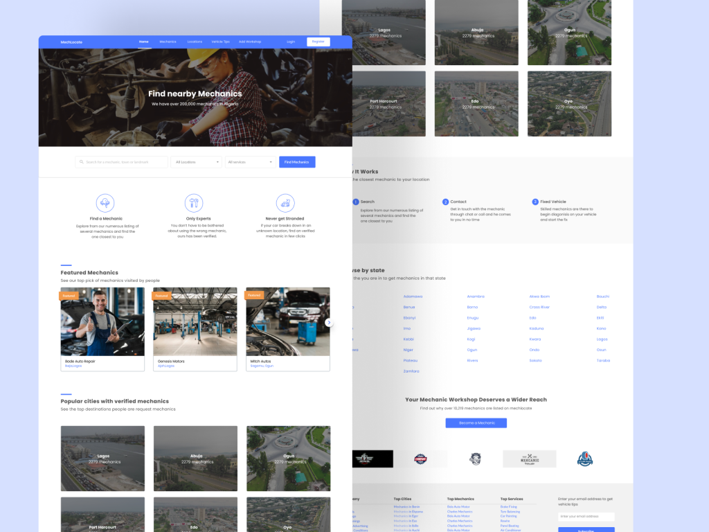
MechLocate is a user-centered mechanic listing platform designed to help vehicle owners quickly find reliable and verified auto mechanics within their locality. Built with a focus on intuitive navigation and seamless user experience, MechLocate connects users to nearby service providers based on location, ratings, and service type—making vehicle maintenance and repairs faster, safer, and more convenient.
Work
UI Design, User Experience Design, User Research, Wireframing, Afinnity Diagram, Usability Testing, Crazy 8’s method, Sketching
Problem Statement
A lot of people have vehicles and most often these vehicles break down, but it’s not just that it breaks down or develops fault but this happens sometimes when the individual is in an unknown/unfamiliar location. Our team was interested in creating a web based platform for a listing service where you can find the nearest mechanic to you once you have a faulty vehicle.
Our target audience are individuals with vehicles, vehicles could be car, bike, truck and so on. Since vehicles might tend to get fault in unknown locations, this platform aims at optimizing search based on the location of the vehicle.
My role
I was the primary designer for this product
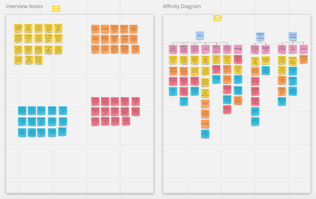
Discovery:Research & Analysis
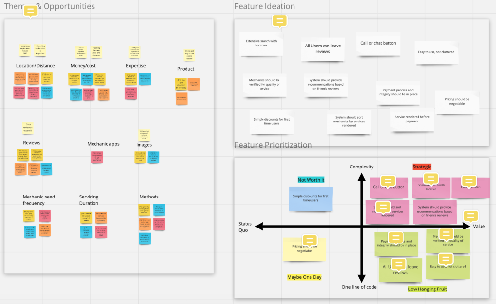
Key findings Vehicle owners take a long period of time getting mechanics to fix their faulty vehicle in an unfamiliar location.
There are limited platforms that offer this service.
Major platforms that exist in the market may place too much emphasis on populating their site with mechanics. We identified opportunities to build a product with a focus on location based search and verified mechanics.
View clearer versions of the images above on Miro.
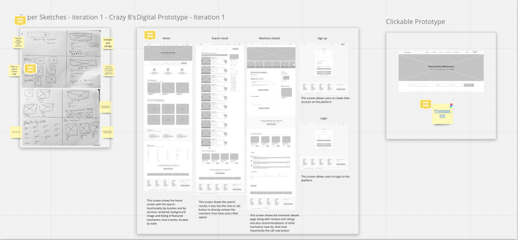
Design: Concepts & Sketching
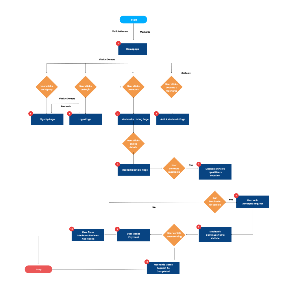
Userflow
I decided to limit my scope in the early stages to come up with ideas. The first thing I did was to draft a user flow map:
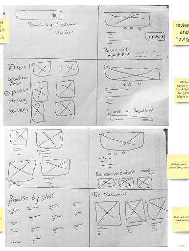
The userflows were followed by using the Crazy 8’s method for idea generation, see sketches below.
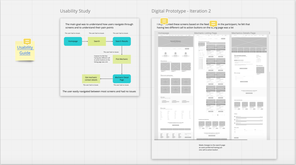
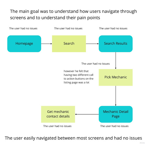
Next, I used Figma to create low fidelity wireframes and ran a usability test to see how users interacted with the wireframes
Using this Usability guide feedback gotten from the usability test was really helpful and I made iterations to the wireframes
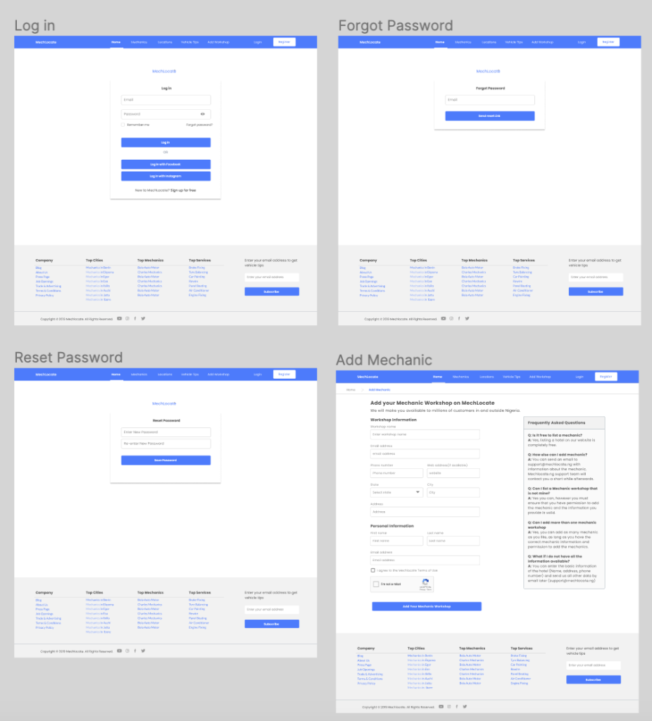
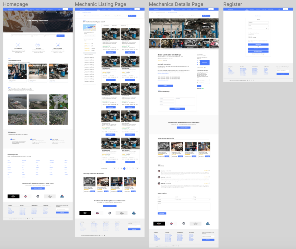
Design: High-Fidelity Design
Getting inspirations
I Signed up to Mobbin and created a “+ New Library” then searched and “Saved” inspirational designs to library, I also checked out other inspirational sites like Dribbble, behance, and Uplabs
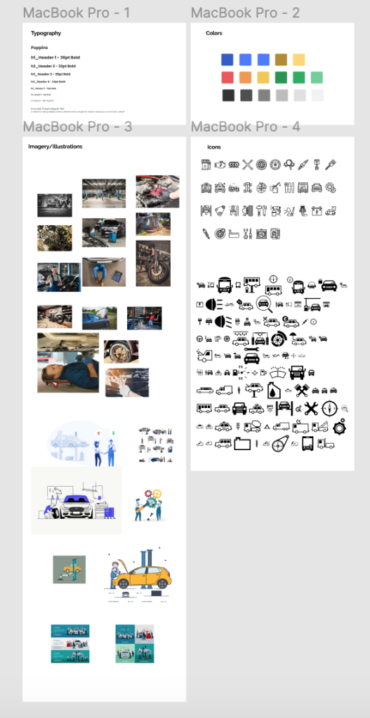
Style Guide
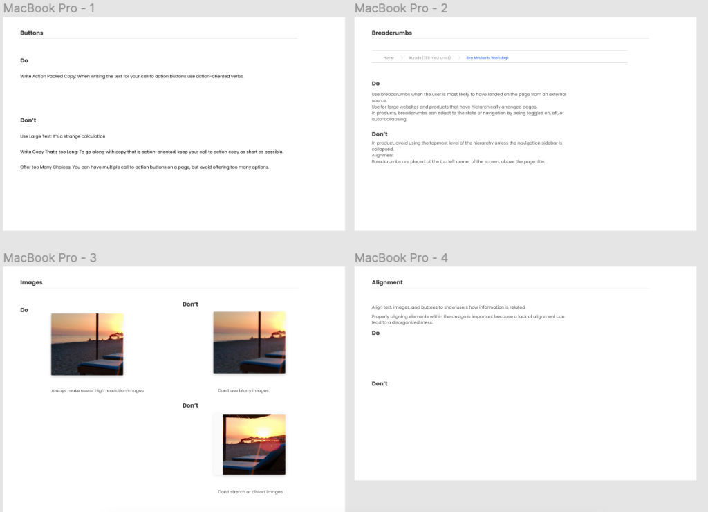
My style guide was designed in Figma, highlighting the following Typography (sizes, weights, and styles), Colors, UI Elements and Styles, Imagery/Illustrations, Icons and most importantly Outline design Do’s and Don’ts.
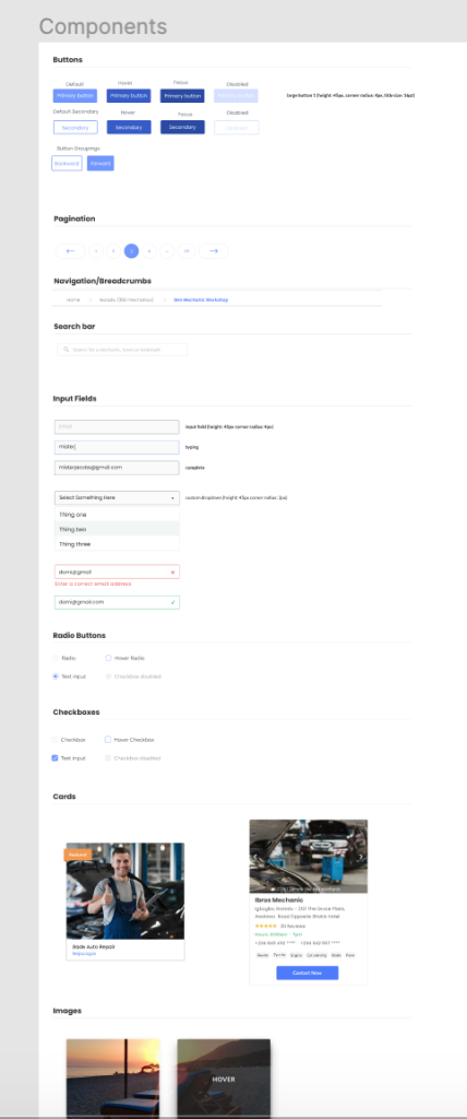
Pattern Library Sheet
Create a frame that includes a list of components you are going to use to create your UI design, which includes: Buttons, Navigation, Other elements that apply specifically to your design (search bars, input fields, lists, dialogs) and most importantly Outline design Do’s and Don’ts.
The color palette I chose had to convey “organization: simple and secure.”
Improving accessibility of the design Feedback from the usability texting was visited, issues and opportunities for improvement in accessibility were noted. Annotation was made on the design screens accordingly
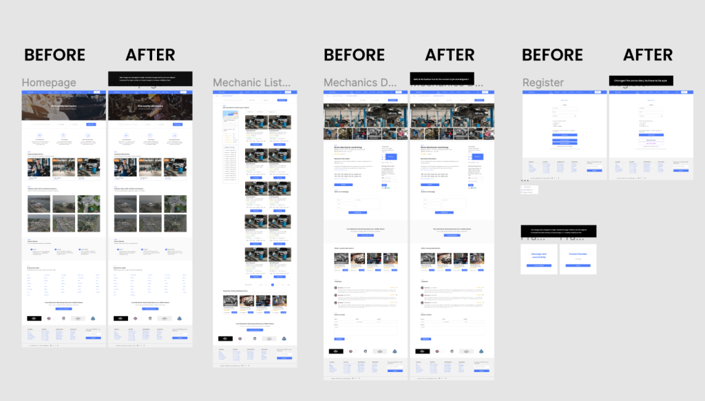
Test Insights Time Spent: The average time spent on the prototype was 6.98 minutes Participants understood and passed most of the task 4 out of 10 participants failed the Click Contact button Task The chat or contact us flow would need some changes.
Usability testing
Design: Iteration
The KPI selected was to Increase Task success rate . Therefore I iterated the designs based on the feedback gotten and the insights, here are the before and after screens done on figma
Solution & Impact Overview
The final assets were on Figma design was exported to Zeplin See link
This entire flow is focused on one goal, which is to help vehicle owners search for mechanics when their vehicle develops a fault in an unfamiliar location.
One of the major challenges I encountered was really during the user research stages, getting research participants. and also during usability test, getting at least 10 participants to test the designs.
Things I would like to do next includes: Users getting a quote, Mechanic dashboard to track all requests and payment.